Città di Ancona
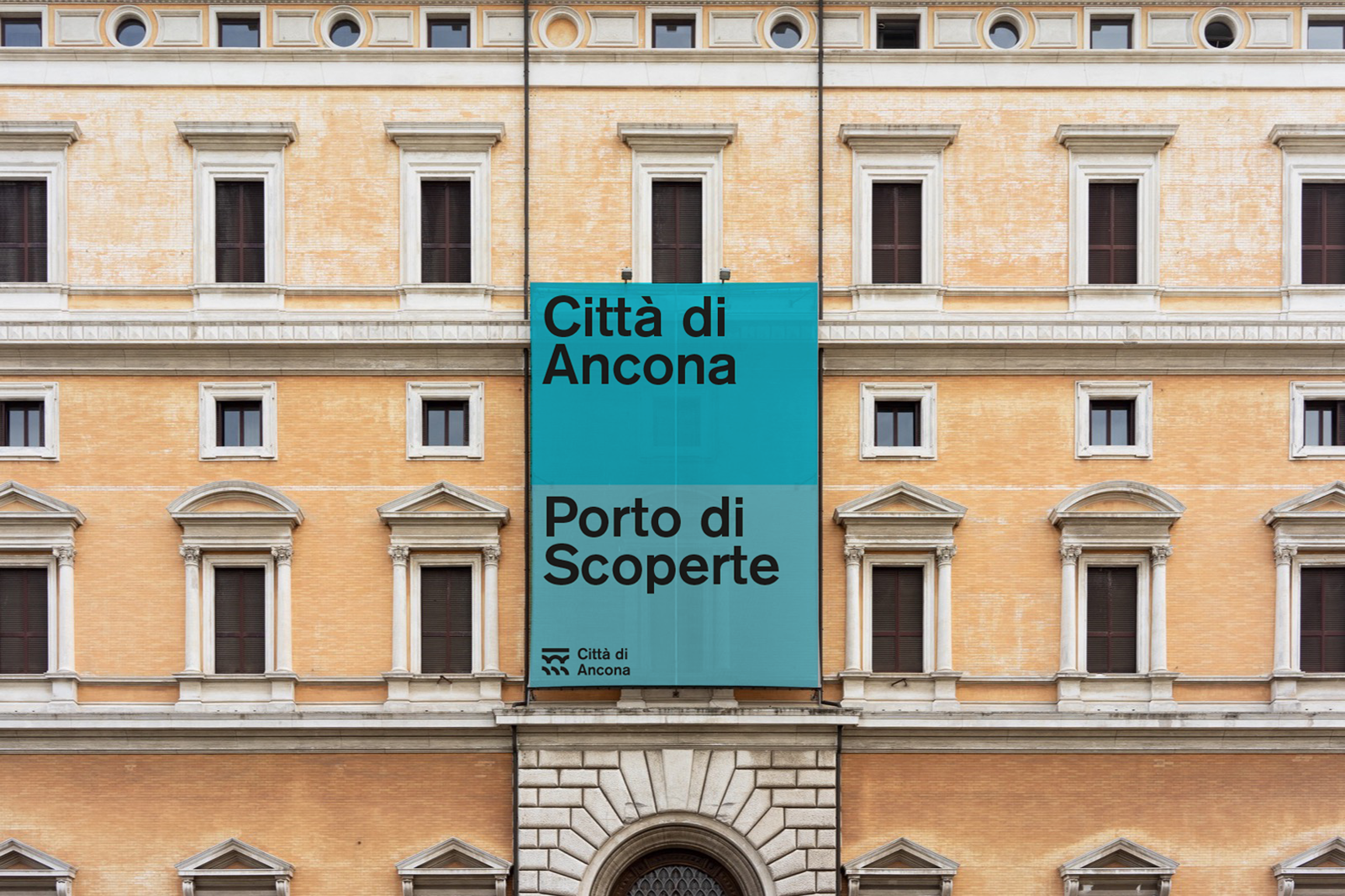
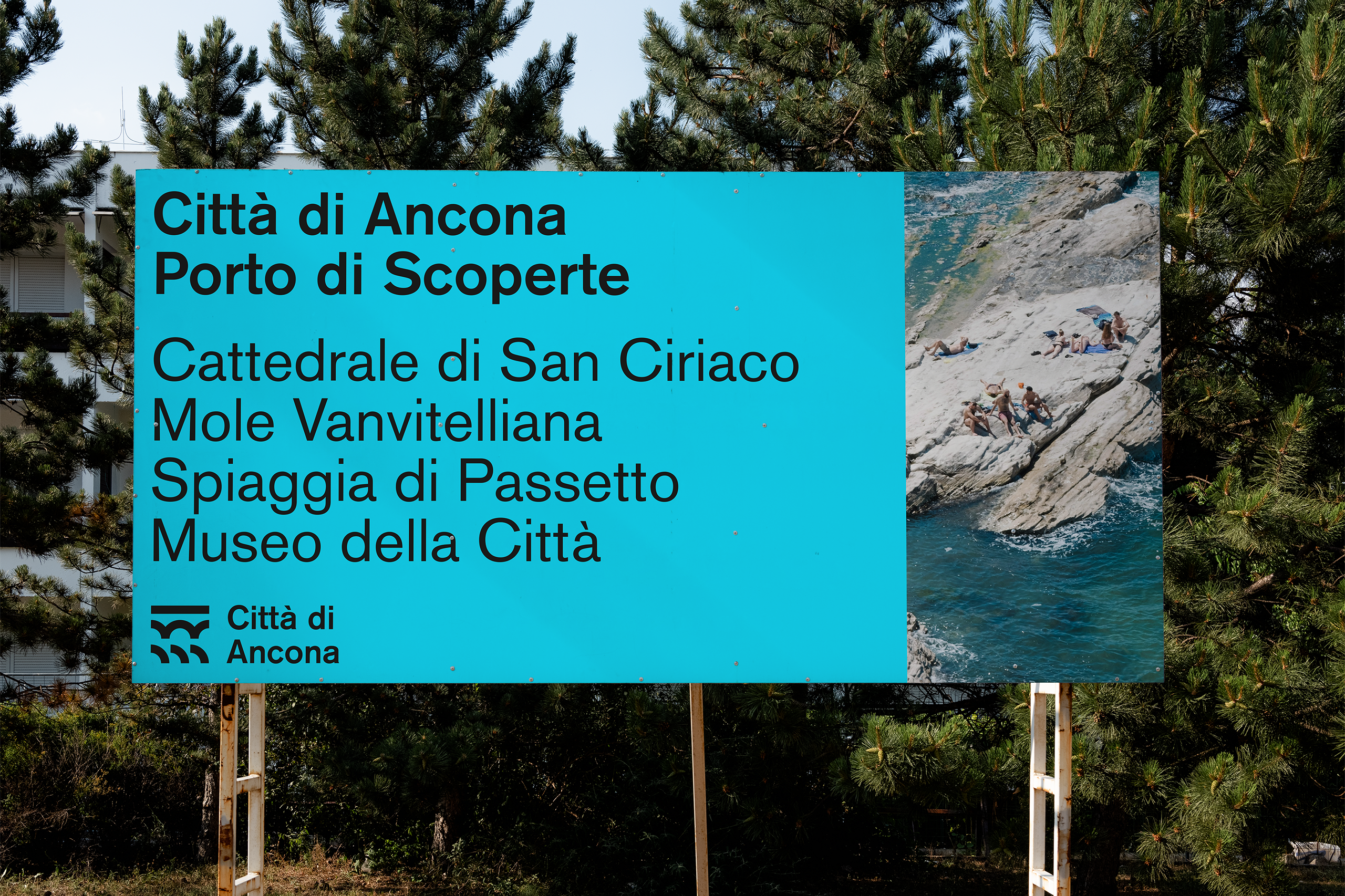
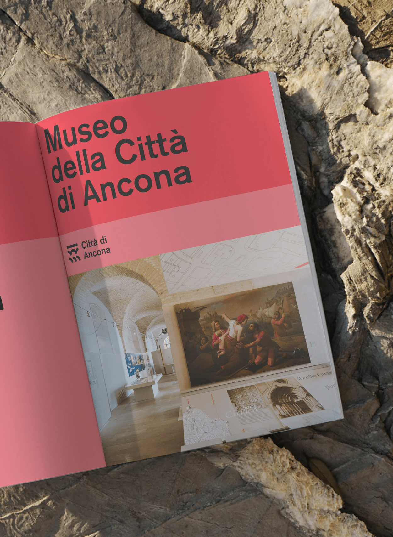
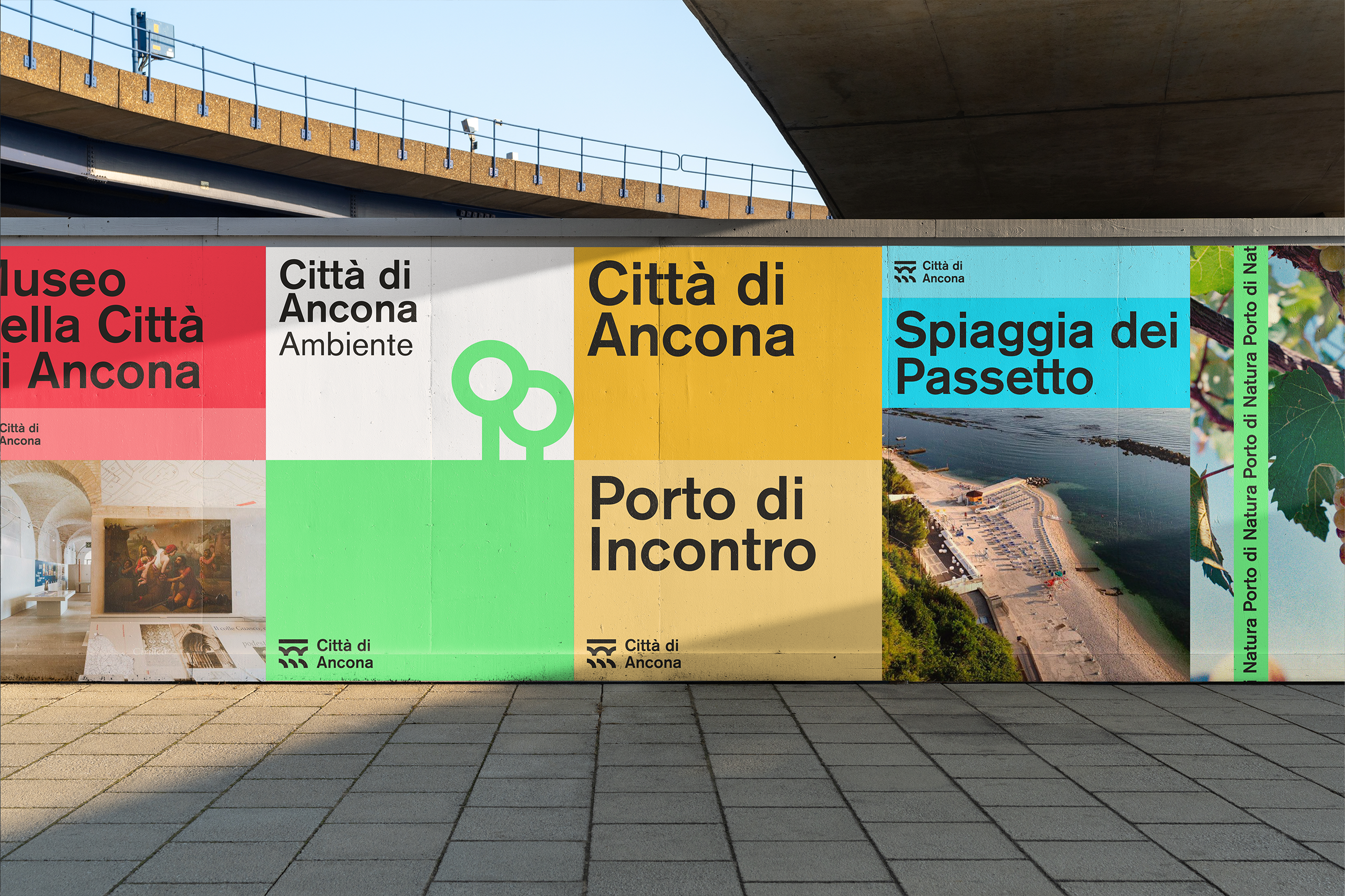
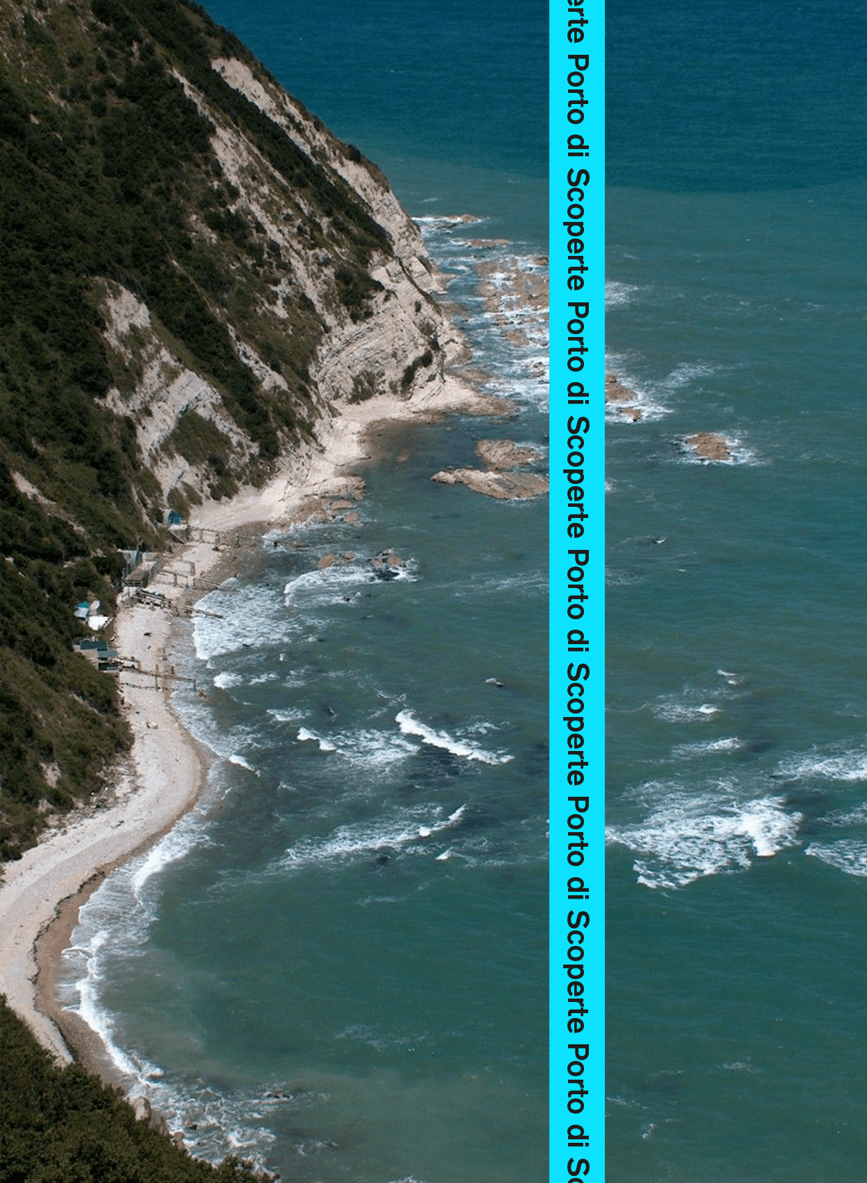
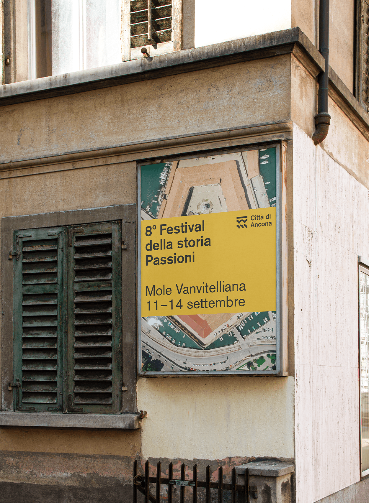
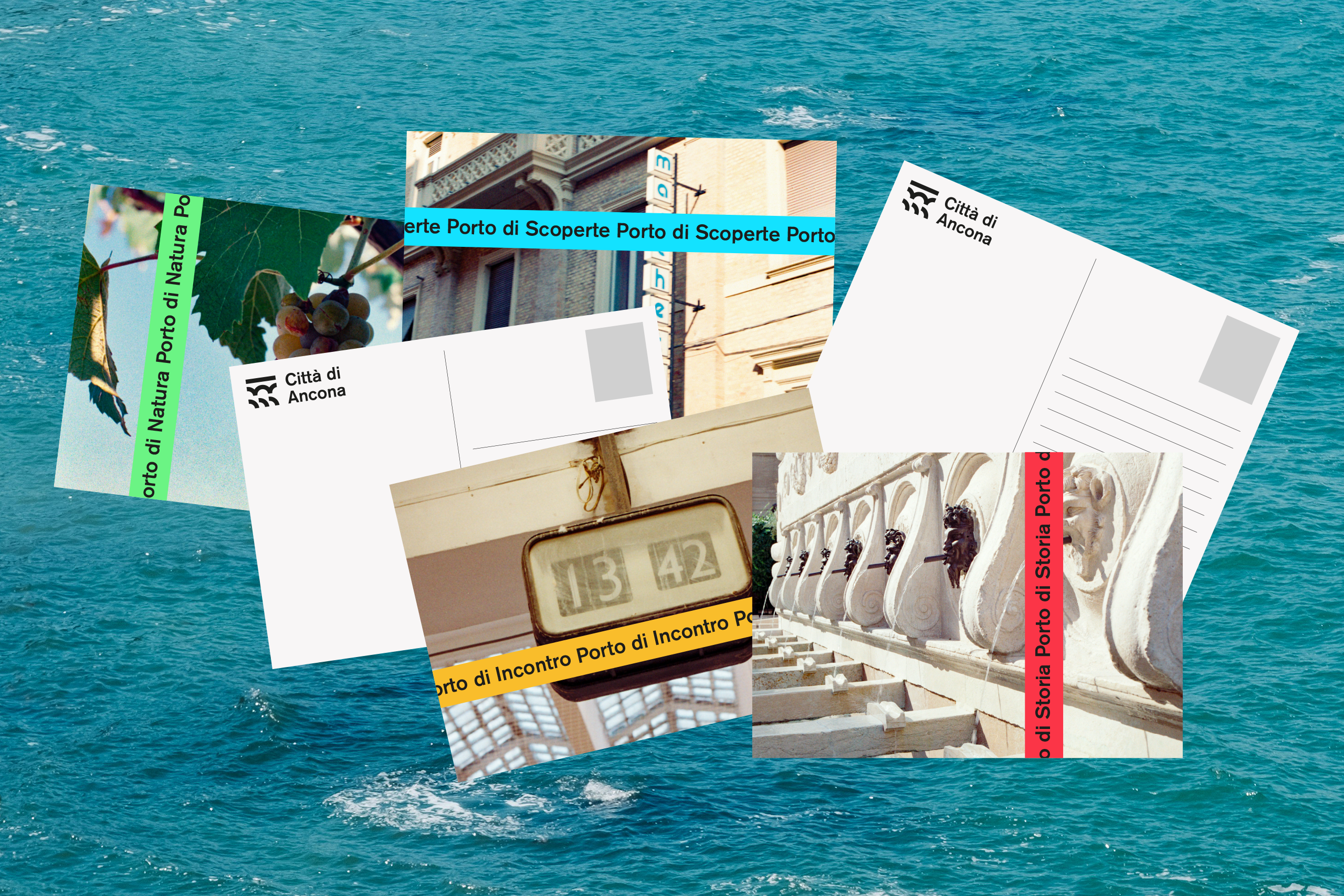
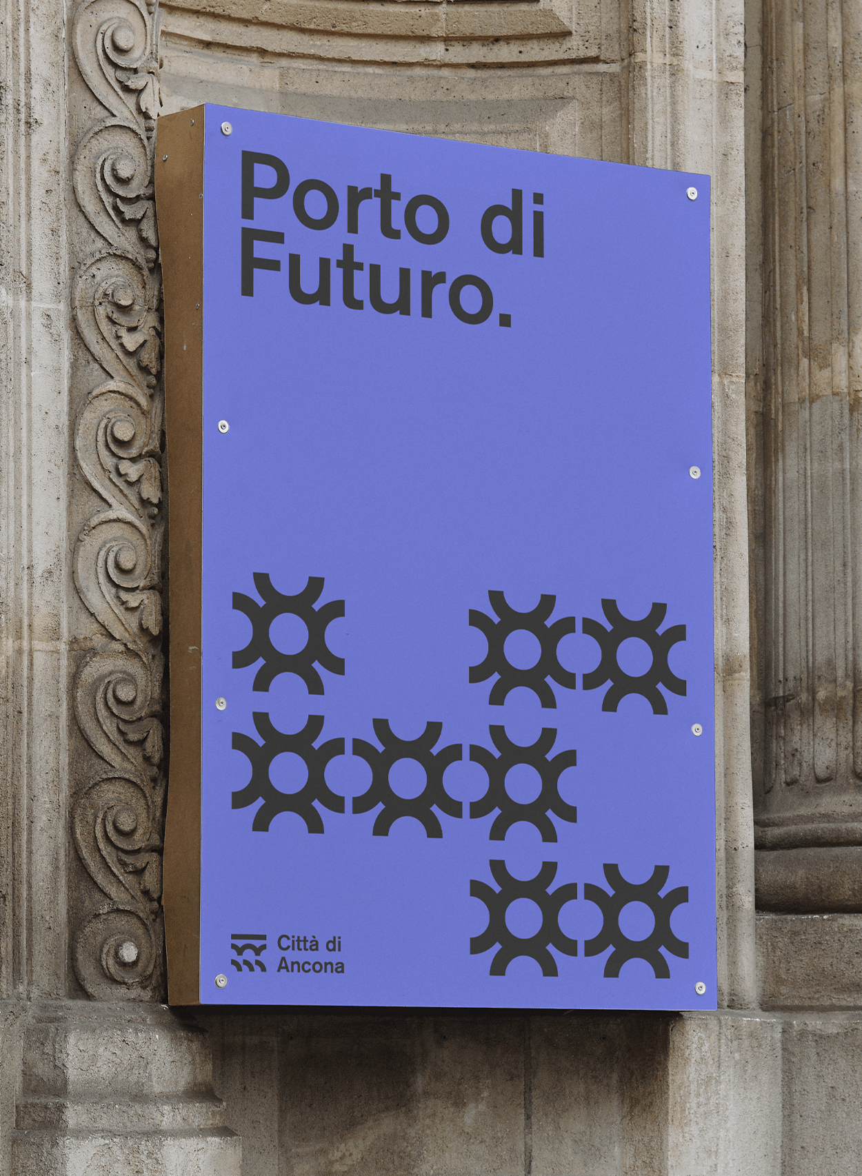
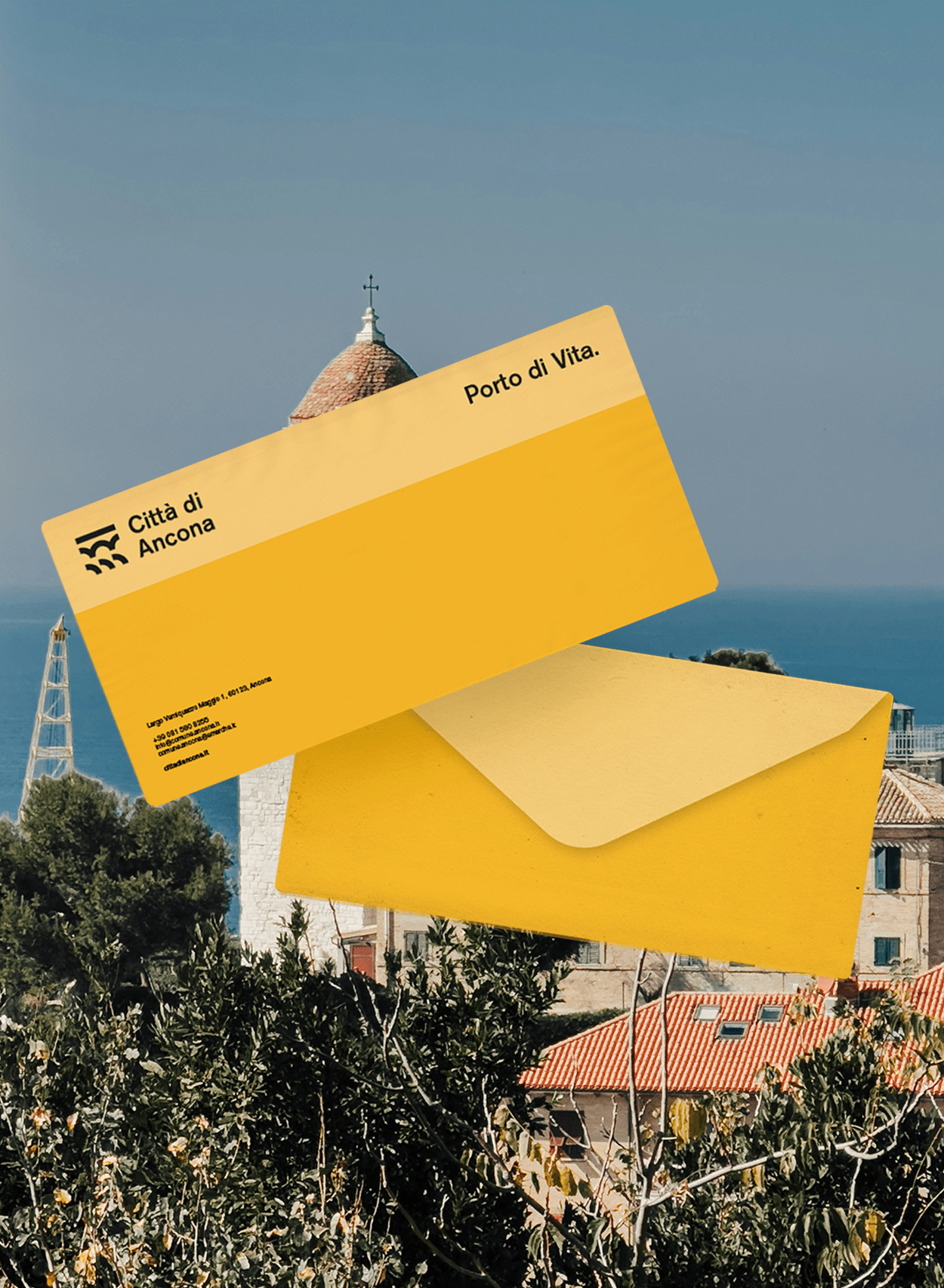
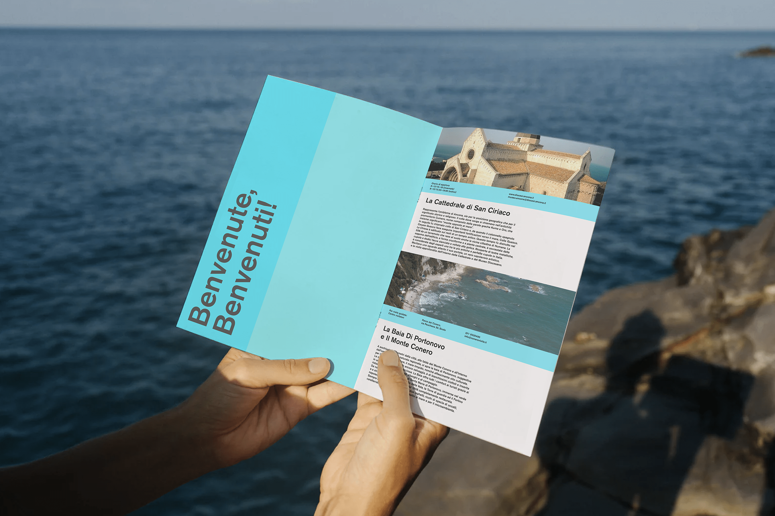
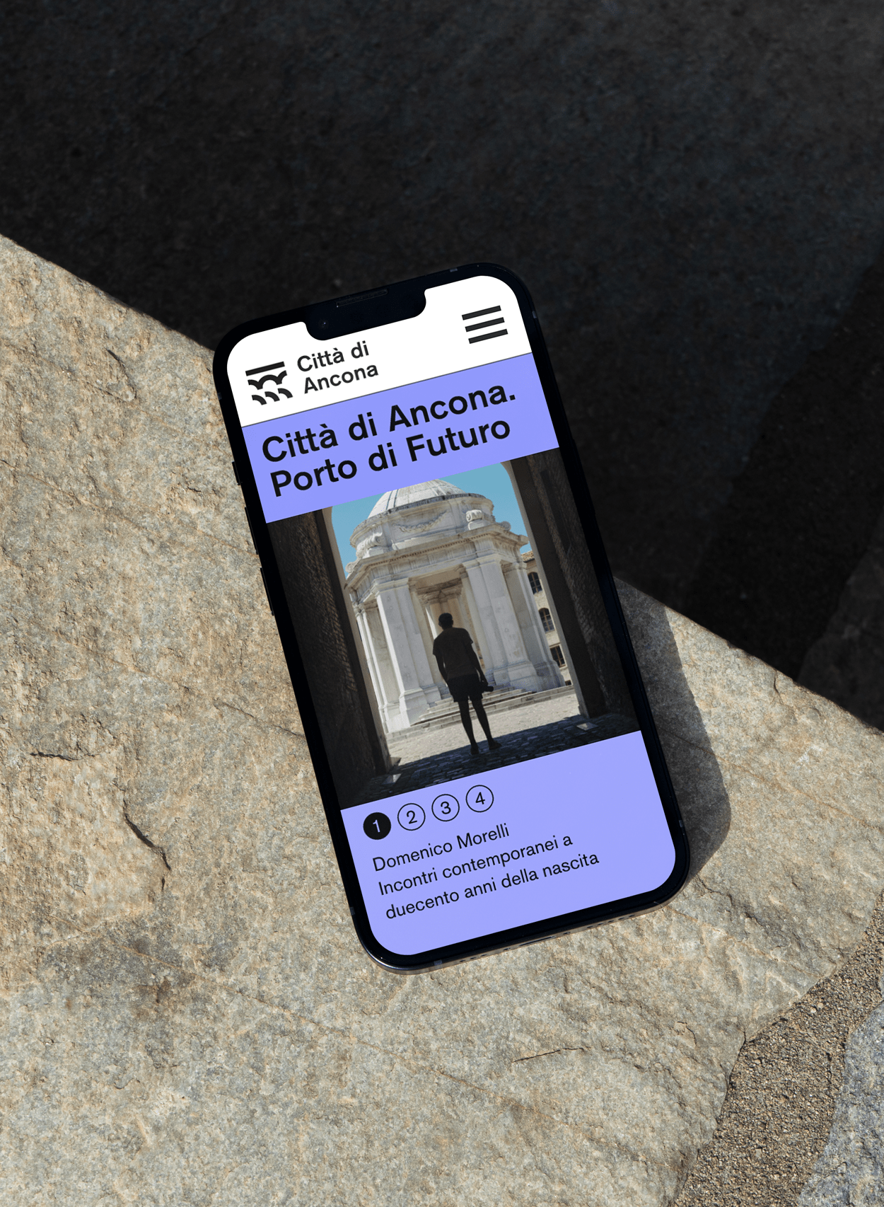
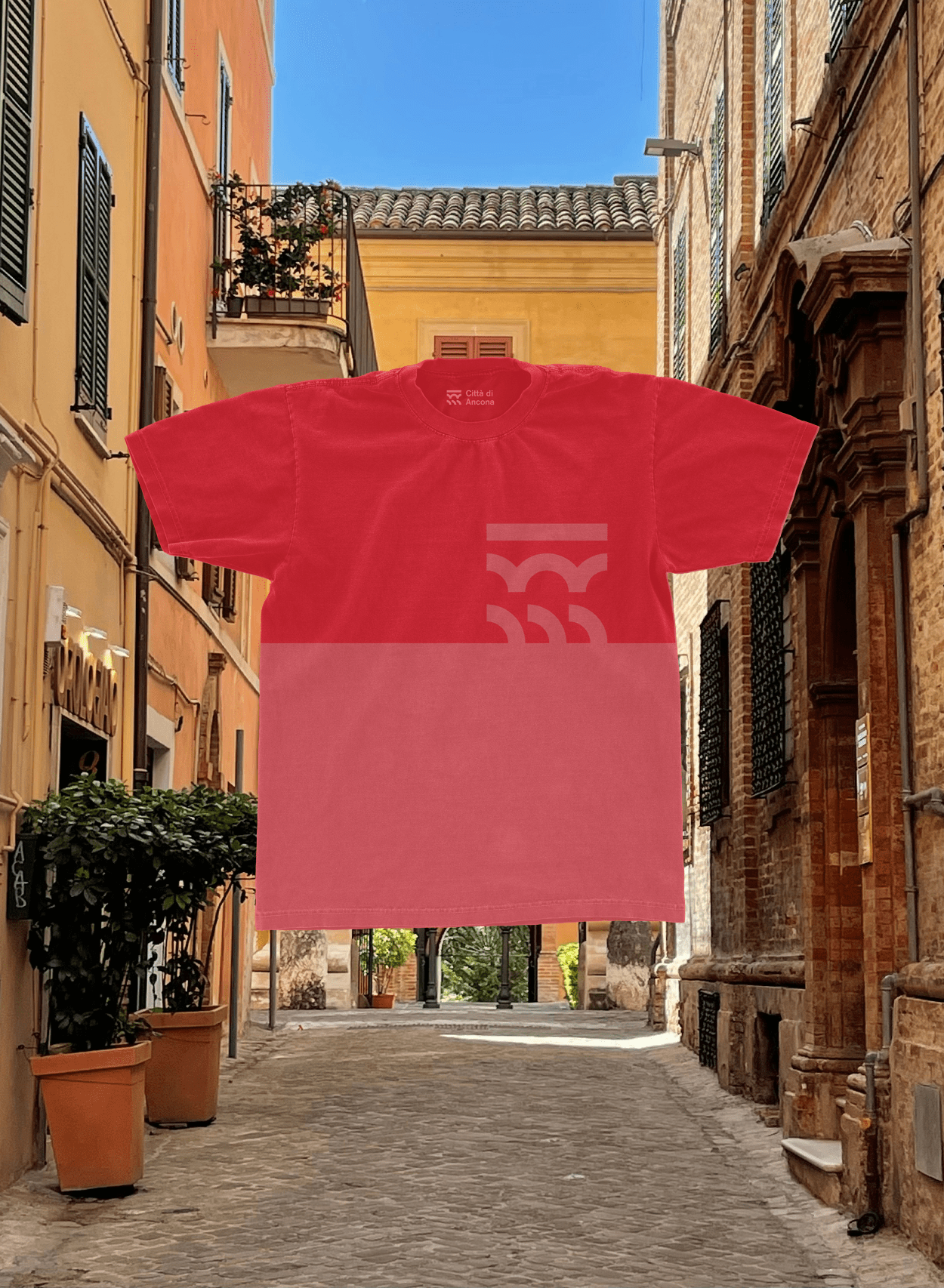
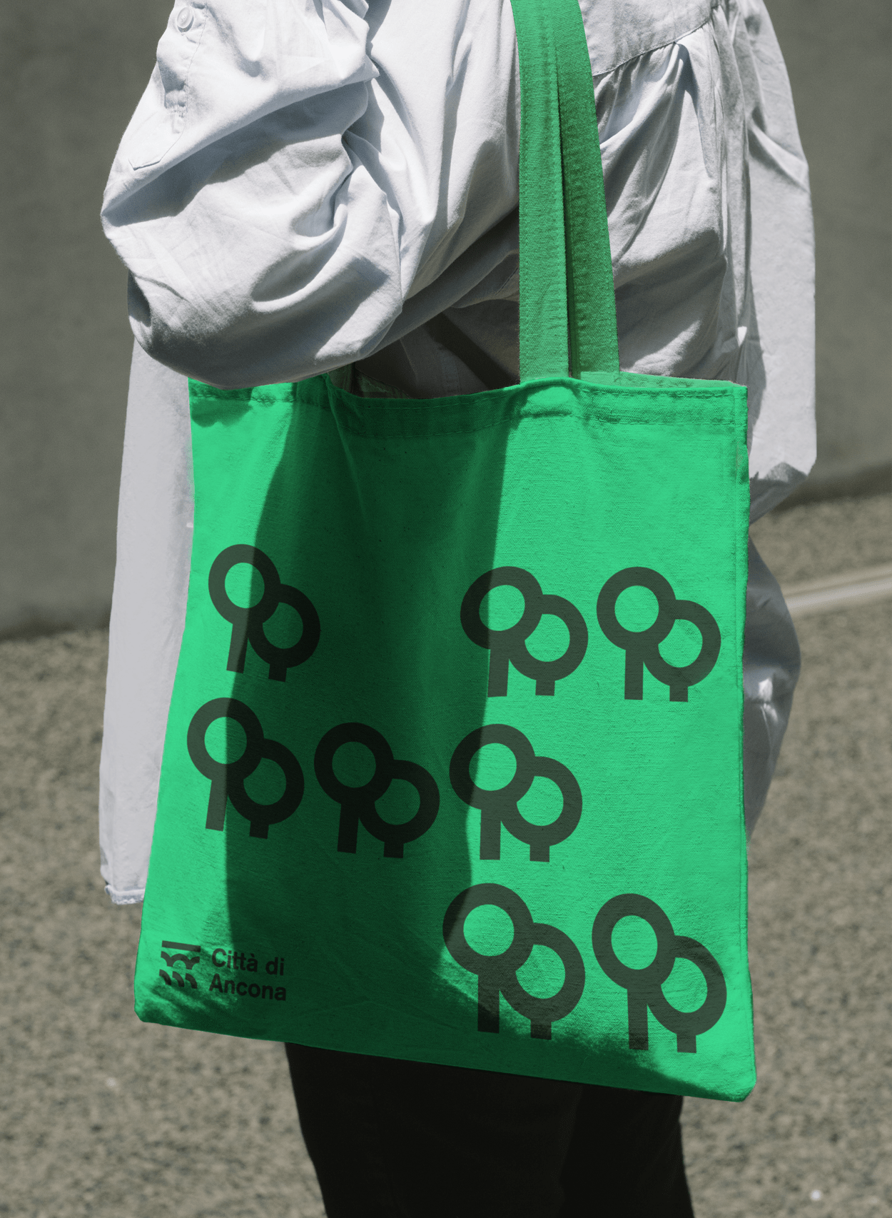
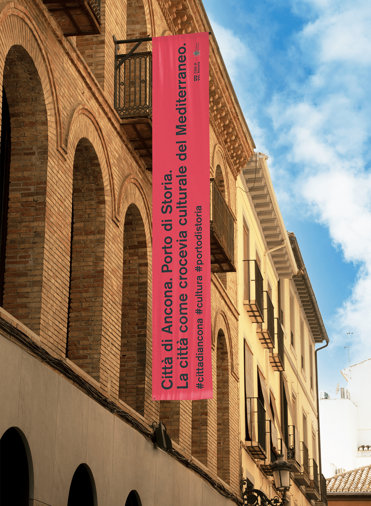
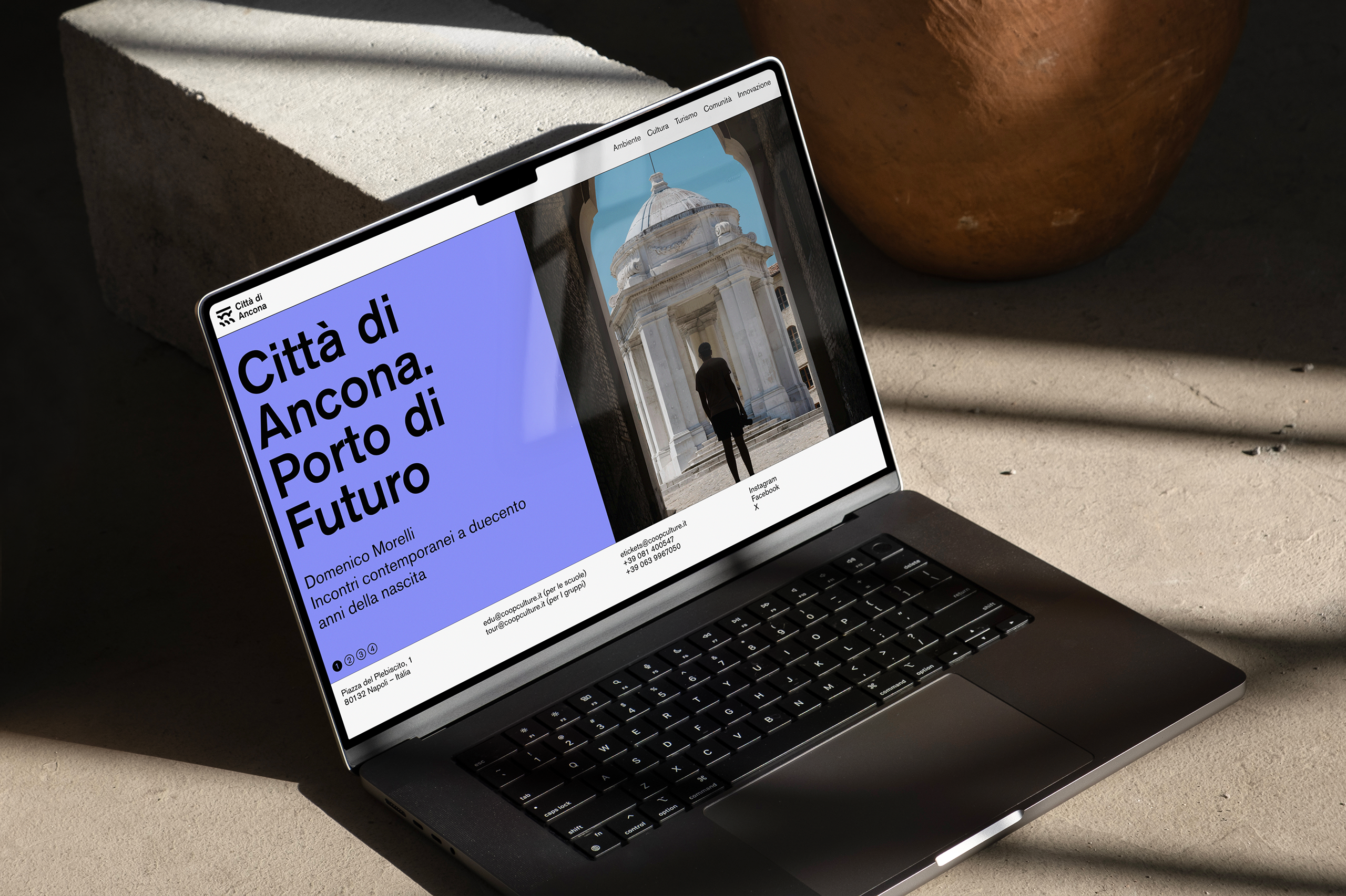
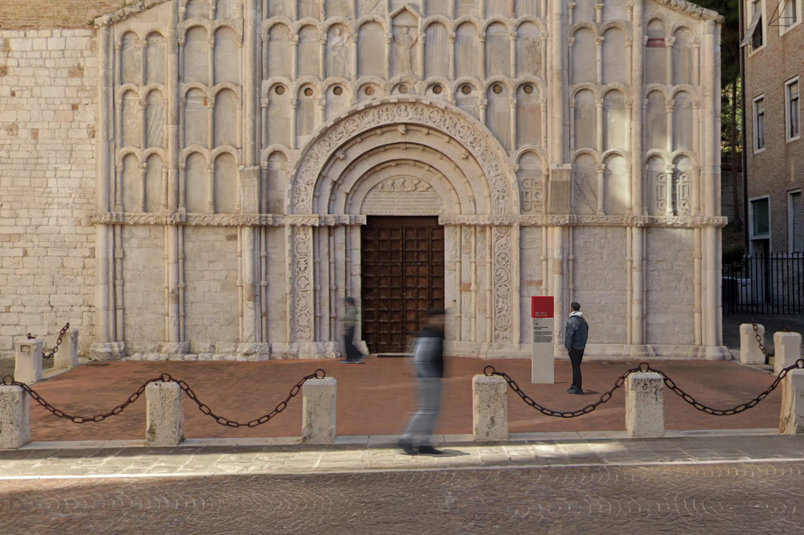
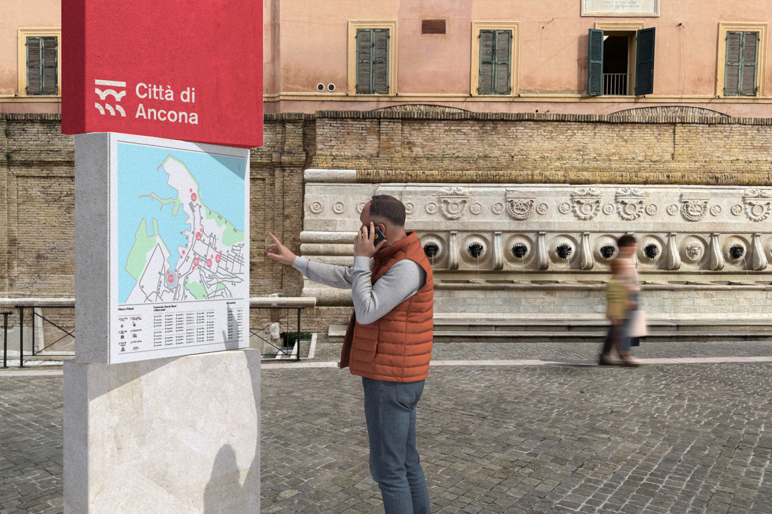
Shortlisted proposal for the branding contest organised by Città di Ancona.
Ancona was born from geography: a promontory that bends into the sea, a natural feature that the ancients recognized and called "Ankón," the "elbow" of Italy. This singular curve, where the land embraces the sea, defines not only the morphology of the city, but also its cultural, economic, and symbolic identity. It is a shape that embodies both function and metaphor: shelter and openness, protection and horizon. Between its structures, both natural and constructed, there exists a constant tension: the sea that invites movement and the land that offers stability and tranquility. It is precisely from this relationship, between fluidity and permanence, between arrival and departure, between the gesture of the land and the force of the sea, that our proposed identity for the city of Ancona is born.The challenge of the competition was not simply to design a logo: it was to conceive an identity system capable of translating the complexity of Ancona, a historic, vibrant, diverse city open to the world, into a contemporary language. The goal was to create a brand that was not merely a graphic symbol, but an institutional, cultural, and communicative tool, capable of representing the city's diversity while simultaneously offering unity and coherence.
client
Città di Ancona
year
2025
location
Ancona, Italy
design
unitedby
Daniela Teixeira
Diana Gaspar
Francisco Branco
Maria Jorge
João Ventura
Miguel Palmeiro
Pedro Palavra
Pedro Sousa
2025 © united by
next project
Ancona was born from geography: a promontory that bends into the sea, a natural feature that the ancients recognized and called "Ankón," the "elbow" of Italy. This singular curve, where the land embraces the sea, defines not only the morphology of the city, but also its cultural, economic, and symbolic identity. It is a shape that embodies both function and metaphor: shelter and openness, protection and horizon. Between its structures, both natural and constructed, there exists a constant tension: the sea that invites movement and the land that offers stability and tranquility. It is precisely from this relationship, between fluidity and permanence, between arrival and departure, between the gesture of the land and the force of the sea, that our proposed identity for the city of Ancona is born.The challenge of the competition was not simply to design a logo: it was to conceive an identity system capable of translating the complexity of Ancona, a historic, vibrant, diverse city open to the world, into a contemporary language. The goal was to create a brand that was not merely a graphic symbol, but an institutional, cultural, and communicative tool, capable of representing the city's diversity while simultaneously offering unity and coherence.
client
Città di Ancona
year
2025
location
Ancona, Italy
design
unitedby
Daniela Teixeira
Diana Gaspar
Francisco Branco
Maria Jorge
João Ventura
Miguel Palmeiro
Pedro Palavra
Pedro Sousa
2025 © united by
next project