case di quartiere di bologna
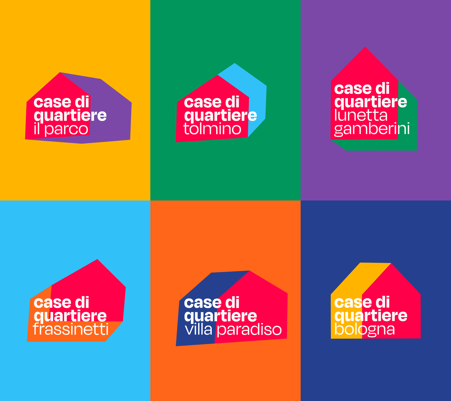
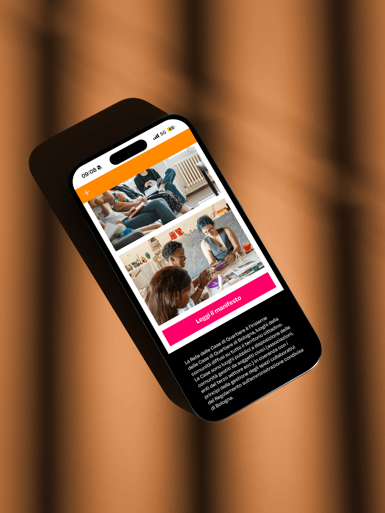
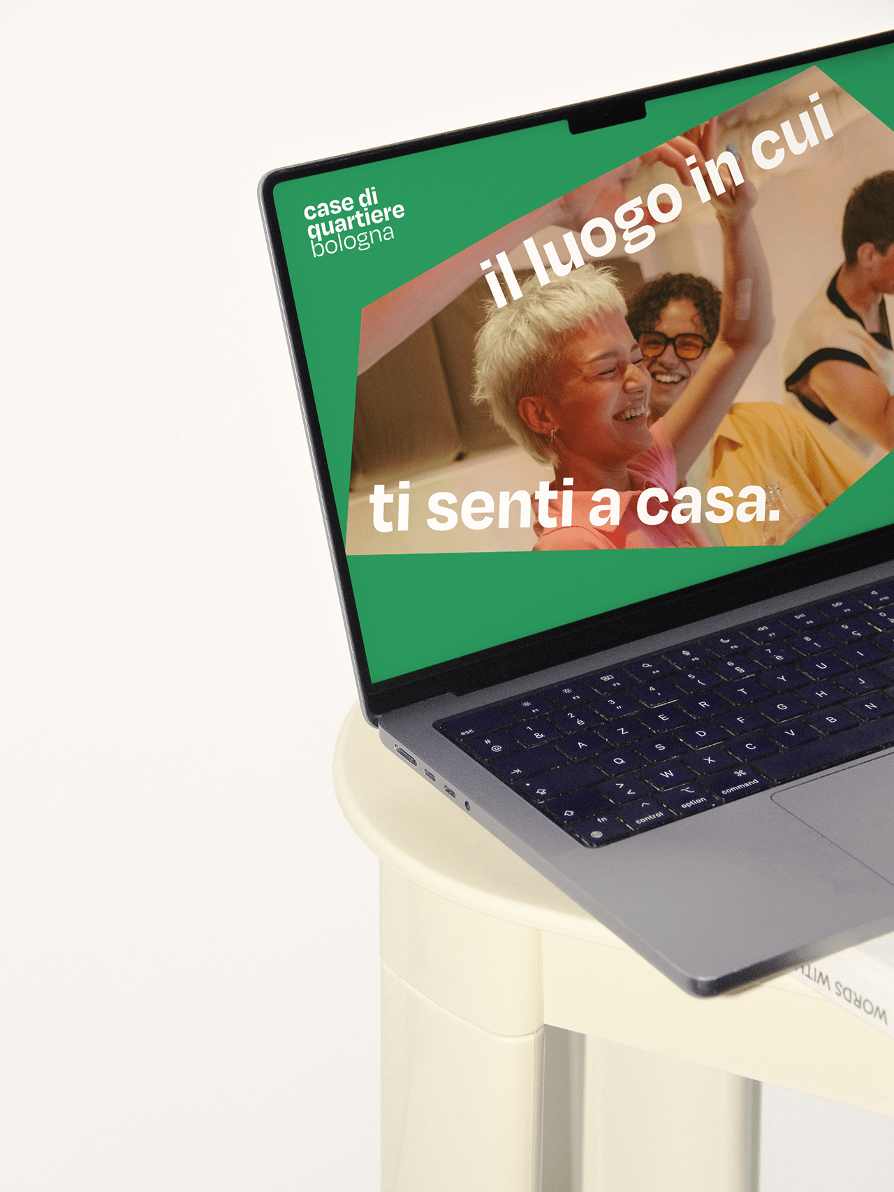
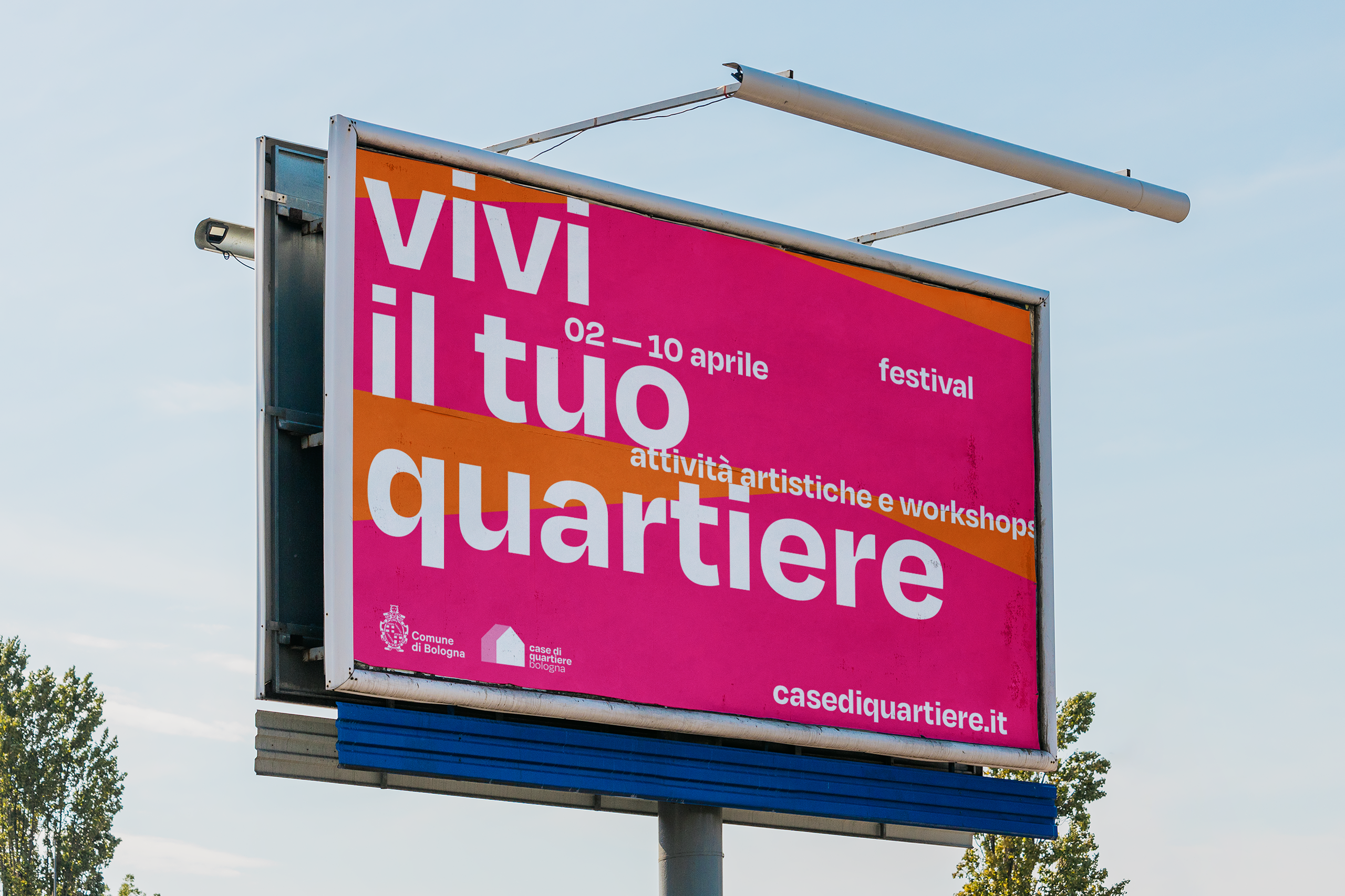
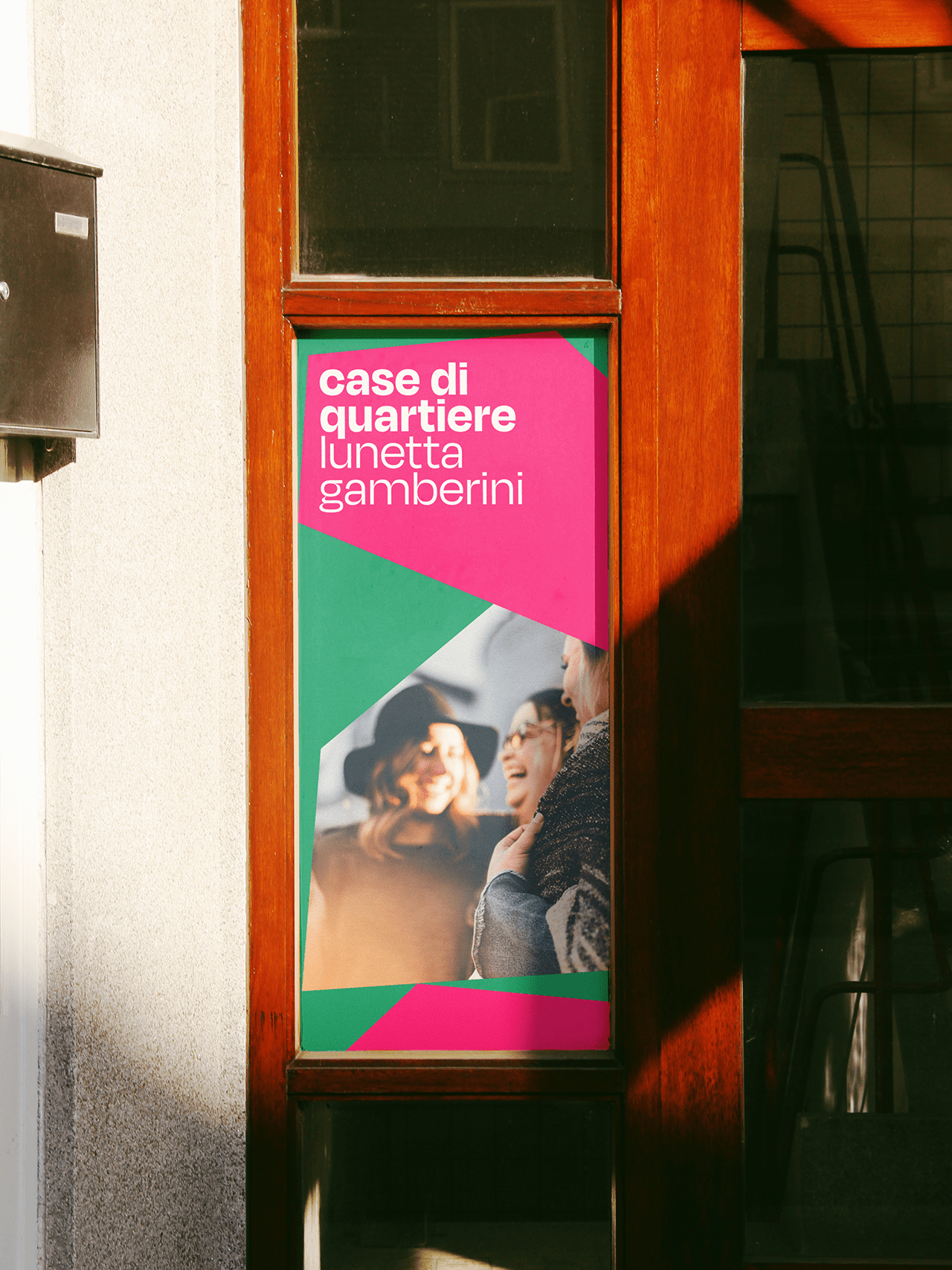
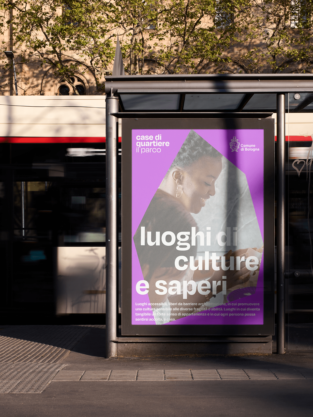
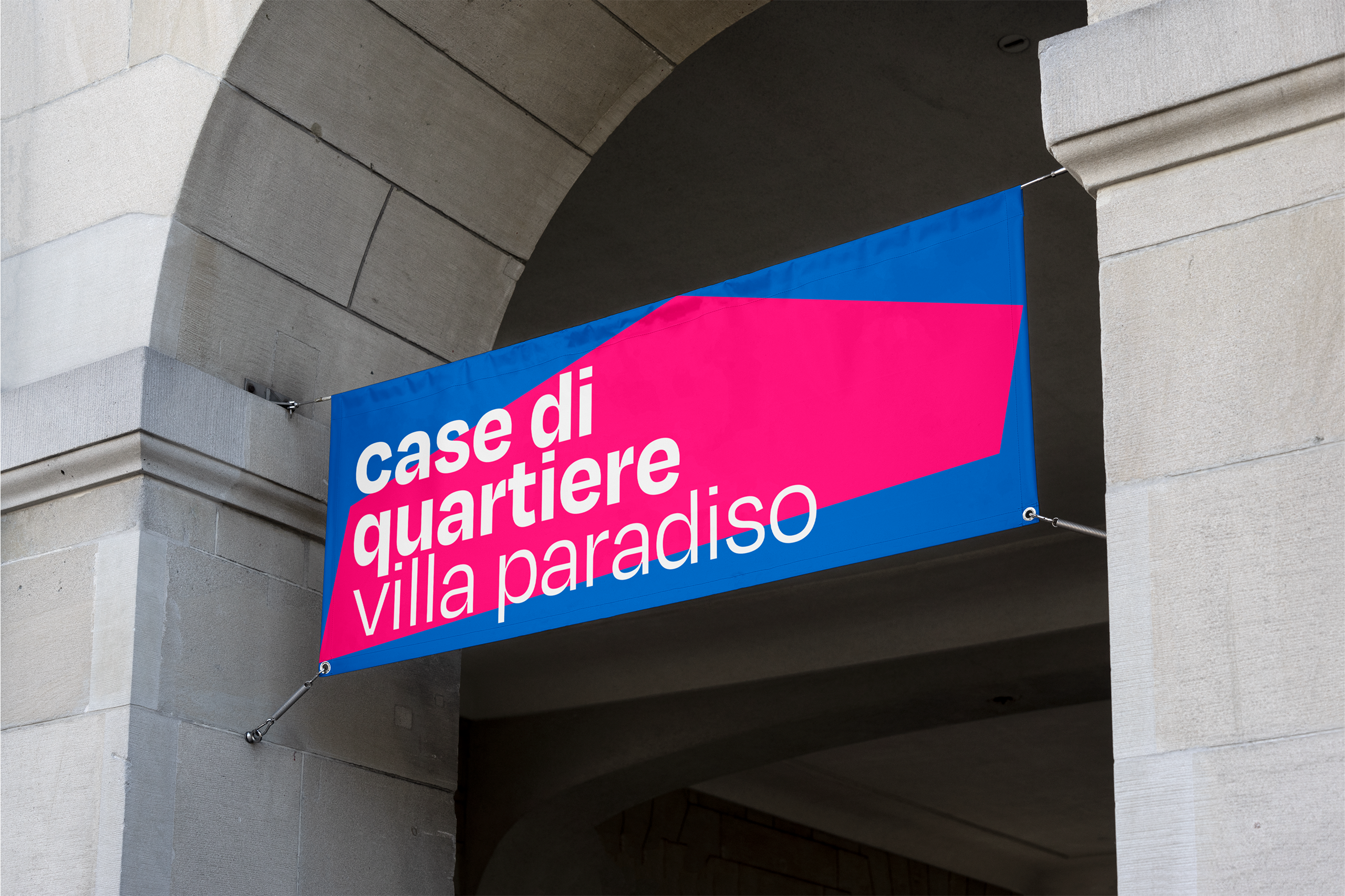
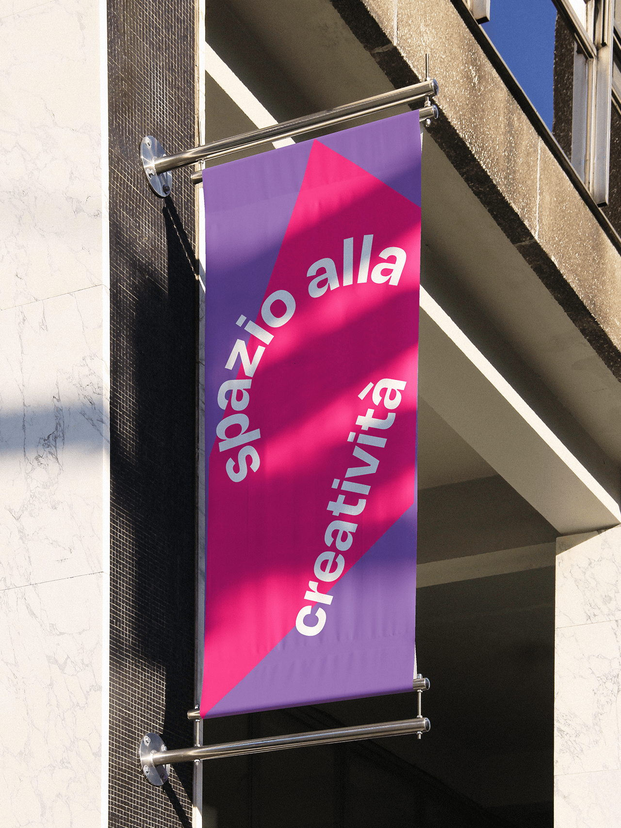
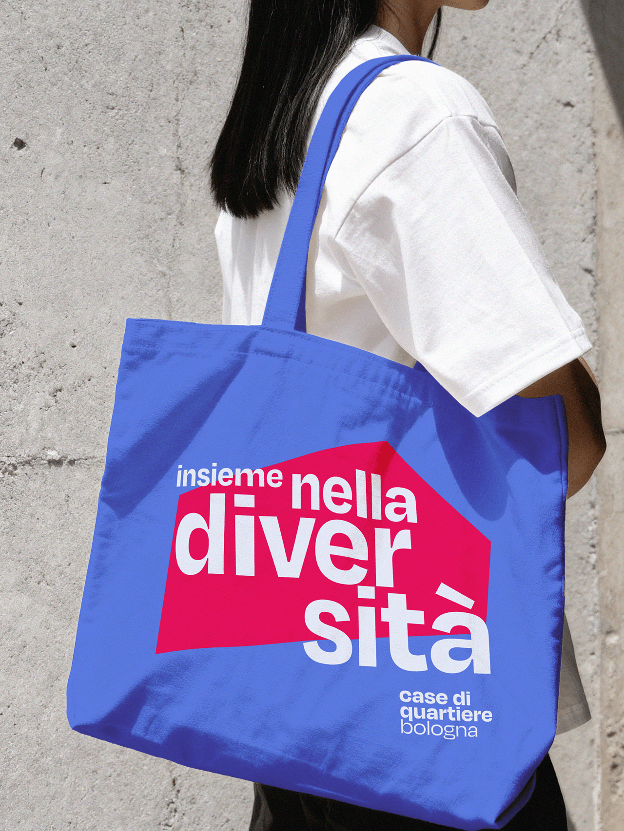
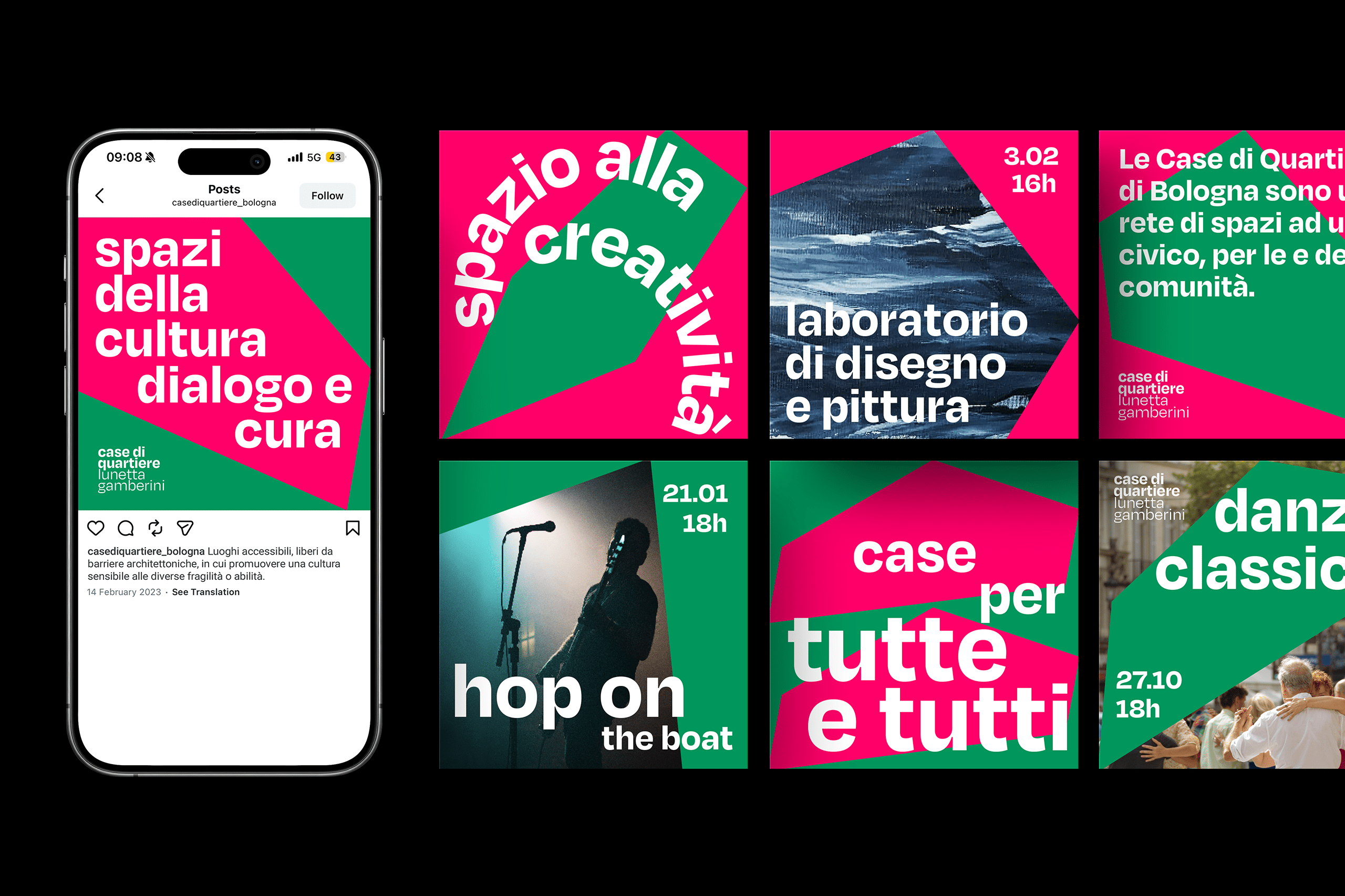
The visual identity of the Casa di Quartiere di Bologna was developed around the principles of inclusivity, belonging, and collective participation, reflecting the broader initiative led by the Municipality of Bologna to transform former senior citizen social centers into “Neighborhood Houses.” These spaces have been reimagined as open and accessible community hubs that promote cultural exchange, social interaction, and new forms of support for individuals and families experiencing situations of vulnerability.
At the core of the identity system is the symbolic representation of the house as a universal space of protection, comfort, and human connection. The concept of "home" transcends its physical structure becoming an emotional and social environment where individuals feel safe to express themselves, build relationships, and share experiences grounded in mutual support.
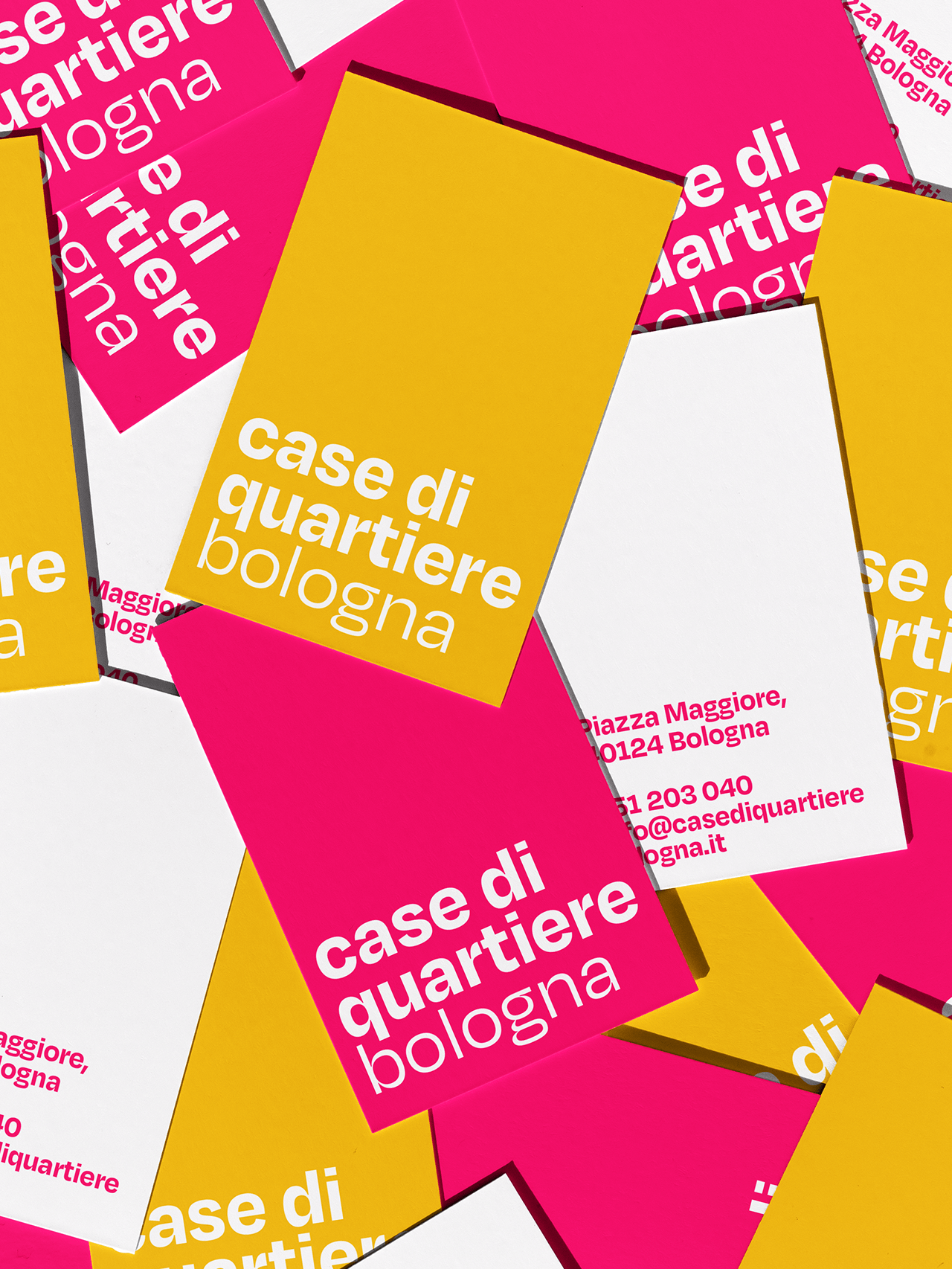
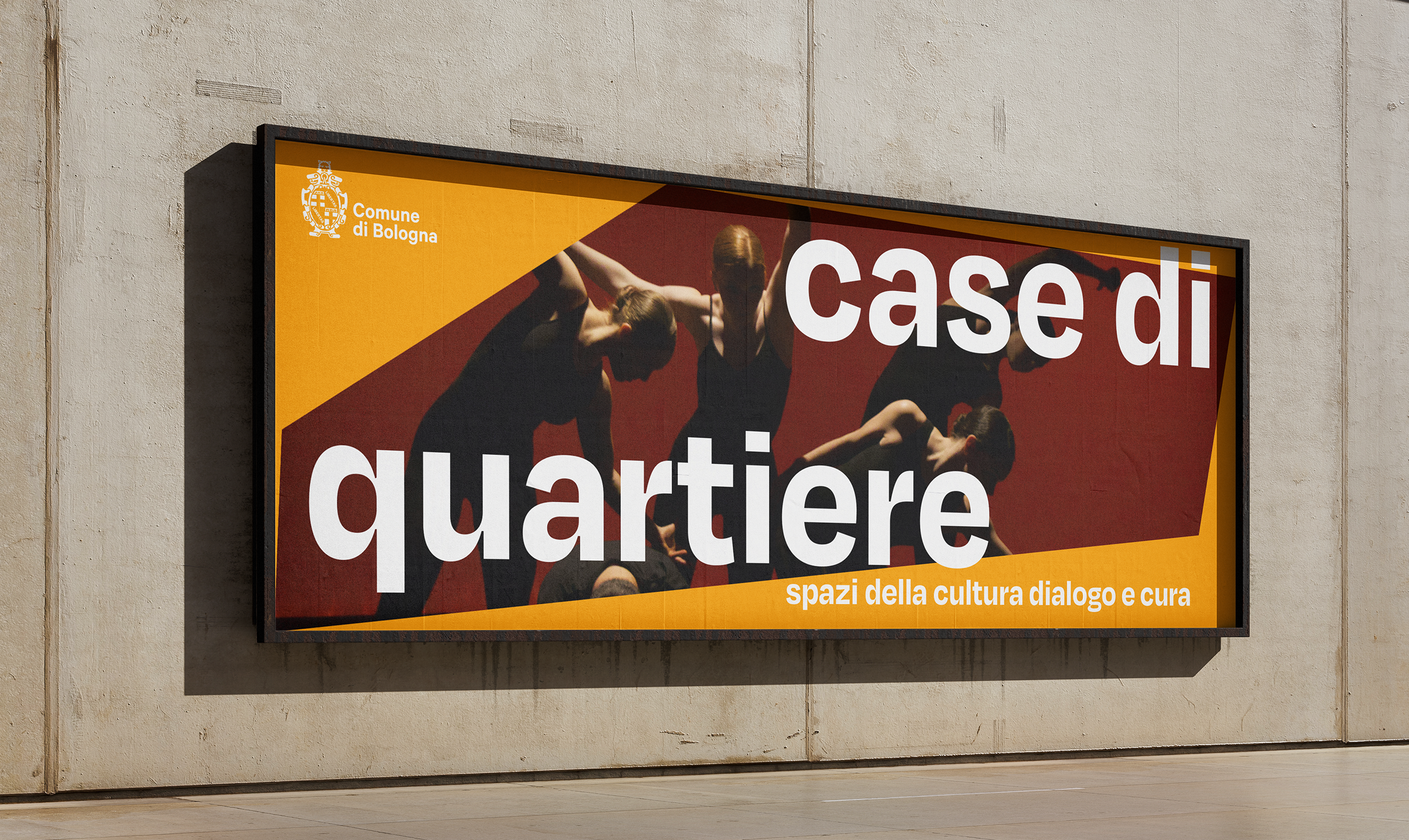
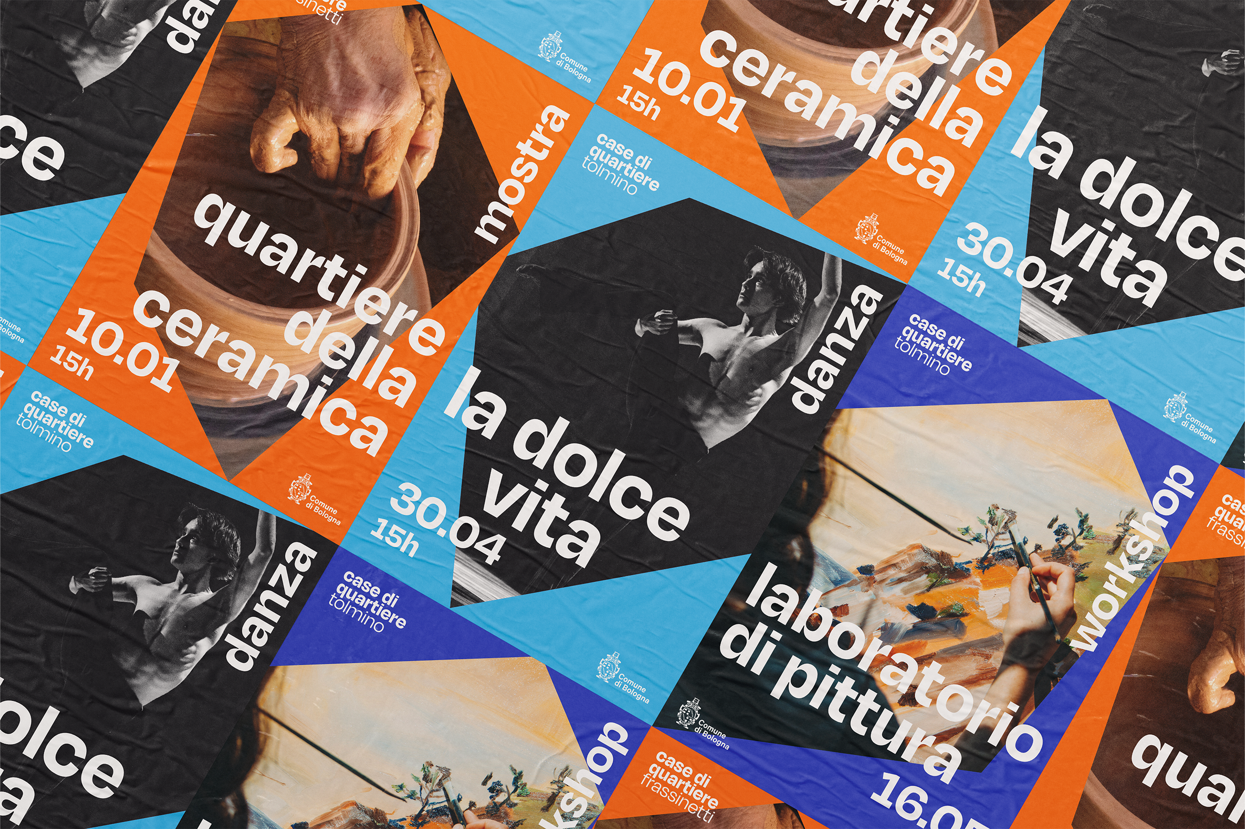
The evolving symbol reflects the diversity of neighborhoods and communities within the network. Its dynamic nature and flexible color palette allow each house to express its own identity while remaining part of a unified visual system. Brand coherence is reinforced through the consistent use of the name “Case di Quartiere,” the typography — Degular by OH no Type Co. — and a shared graphic language based on geometric forms used as transparent and flexible framing devices. The imagery highlights both the cultural and recreational activities promoted within these spaces and the sense of well-being, togetherness, and community they foster.
client
Comune di Bologna — Fondazione Innovazione Urbana
year
2022
design
Cátia Lima
Miguel Palmeiro
next project
At the core of the identity system is the symbolic representation of the house as a universal space of protection, comfort, and human connection. The concept of "home" transcends its physical structure becoming an emotional and social environment where individuals feel safe to express themselves, build relationships, and share experiences grounded in mutual support.
The evolving symbol reflects the diversity of neighborhoods and communities within the network. Its dynamic nature and flexible color palette allow each house to express its own identity while remaining part of a unified visual system. Brand coherence is reinforced through the consistent use of the name “Case di Quartiere,” the typography — Degular by OH no Type Co. — and a shared graphic language based on geometric forms used as transparent and flexible framing devices. The imagery highlights both the cultural and recreational activities promoted within these spaces and the sense of well-being, togetherness, and community they foster.
client
Comune di Bologna — Fondazione Innovazione Urbana
year
2022
design
Cátia Lima
Miguel Palmeiro
next project